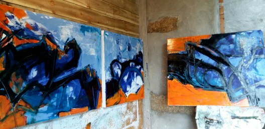
laying the groundwork


I was priming a large piece of coarse jute canvas today with gesso. A long piece 3m x 120cm, rolled out on the mucky floor of the studio.

I took photos as I worked as usual. Of the process and the light and shadows. Of me working. Of the canvas up on the wall. Of the fire.Pondering all the while on what I’ll actually paint once it’s ready


Messed with the photos on Instagram later. Cropped. Negative. Brighten. Contrast. The wee pebble embedded in the rough cement render. In blue. In yellow. The fire. The different rectangles. In triplicate.


The studio is always a painting. In a painting. Of a painting. During a painting.

2016 retrospective

Painted end of 2015

Sold early 2016 and paid for my trip to San Francisco and New York! 


Working on my ‘Rock in the sea’ paintings in February


Some huge pieces on unstretched jute in March


‘Tis calm indeed’ and ‘Moon rising’ from my Spring residency at Stiwdio Maelor in Corris, Wales 


The huge, rather surreal piece on unstretched jute ‘Clouds’ from May


The 5 piece orange and blue and black canvases – can’t remember their titles! June


The two big (120cm sq) pieces, ‘Stateside’ made in anticipation of my  big US trip in June


Small works on paper (these 2 are ‘Berkeley’ & ‘5th Avenue’) made on the go during my fantastic, life changing USA adventure in June and July


Some of the big bold pieces I made in July as soon as I got back from New York 


‘The path’ & ‘Convergence’

August works in the back kitchen in Wales


‘The dance’ & ‘Columba’ also from August in Wales


Works from my second residency in Stiwdio Maelor in Corris, Wales in September 


November


December!

Looking forward to 2017

shibui

​I have been playing with these ideas and tones, this extract is from Wikipedia:

Shibui (渋い) (adjective), shibumi (渋み) (noun), or shibusa (渋さ) (noun) are Japanese words which refer to a particular aesthetic of simple, subtle, and unobtrusive beauty.

The colors of shibusa are “muddy” colors. For example, in interior decorating and painting, gray is added to primary colors to create a silvery effect that ties the different colors together into a coordinated scheme. Depending upon how much gray is added, shibui colors range from pastels to dark. Occasionally, a patch of brighter color is added as a highlight.

The seven elements of shibusa are simplicity, implicity, modesty, silence, naturalness, everydayness, and imperfection. 

https://en.m.wikipedia.org/wiki/Shibui

without you can’t get in

It started with a search for something to paint over because I’ve run out of canvas.

I chose these 2 as they are rather boring and not too textured or lumpy

They are each 70 x 50cm on board

I laid down some first layers and decided to turn them sideways

I was thinking about people out on the street during these cold winter nights and started to make some loose marks with solvent and a palette knife. I have some new gold Winsor and Newton oil. Added some of that, mixed with wax, with a roller. The shapes are clumsy and awkward

The song from Paul Simon’s new album, called wristband, the third verse running through my head. The bit about riots and how not having a wristband to get you in the door becomes a metaphor for the excluded and disenfranchised. Thinking about the election of Trump. And Brexit.

http://www.songfacts.com/detail.php?id=40220

Add more colour. Roll over and obliterate most of the scraped marks. Make some new marks with a graphite stick

Thinking too about the desperate situation in Aleppo. And David Wolfe’s moving and horifying before and after photos on Facebook 

https://m.facebook.com/story.php?story_fbid=1290315790990889&id=100000374406030
It’s not about pretty pictures

What is it about? Painting? What do we do it for? Why? How? Is there any point?

Darker and deeper

More confusing

I don’t know. But I keep painting

(Header image is another stage on the journey, not the finished image – I signed it then changed my mind)

Blood and concrete


2 canvases each 100 x 80cm (39 x 31.5″)

As 2016 draws to a close I’m trying, against the odds, to look ahead to 2017 with hope.

Hope that we will all be mindful of anything we can do that helps rather than hinders. In so many areas. For Peace. For People. For the Planet 

The paintings above are called ‘blood and concrete’.

an extra layer


Just reworked these 2 with a few more marks and a layer of creamy coloured transparent oil and wax mixture

They are each 80cm x 100cm and are part of the ‘Oceans – a tipping point?’ series from last week

I think they are much better for the extra later.  What do you think?

Here they are as they were before:


panoramic

I am really enjoying working on a much larger scale on unstretched canvas stapled directly to my wooden studio painting wall.

The top one shown here, (Martello Tower), is at my maximum size possible, fitting snugly into the full depth of my studio extension and completely covering the wooden panel cladding that is fixed over the planks.( The photo shows the painting cropped of its blue surround, which allows for it to be stretched to an approximate final size of 150cm x 275 cm.)   The unstretched canvas is 120cm x 290cm ( about 4′ x 9’6″)

Here is the primed unstretched canvas, followed by the first stage of underpainting:

The other two paintings are each 115 cm x 160cm  ‘Out walking one evening in November, Cruit’ and ‘Once they danced at the crossroads – ruined gables, Cruit’