island life

It started like this, a huge piece of primed canvas (160 x 258cm, the end of the roll), stapled to the floor.

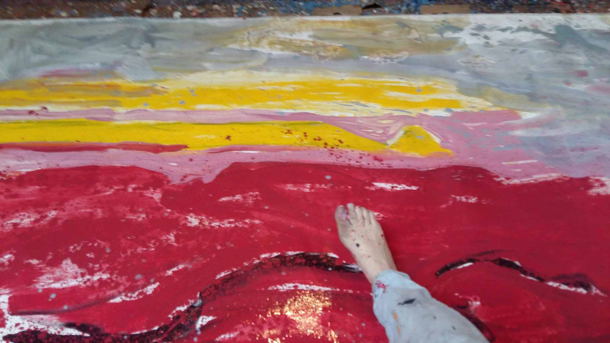
It took up so much of the floor that I had to stand on it to get round it


After a while working on it on the floor, I got Malachy to help me hang it sideways on the wall

And then I turned it round the right way

I taped off the edges, built up more layers and thought it was done.

But something was unbalanced

So finally I took the plunge


There she blows!

Here’s a closeup 


And here’s a photo montage


A good day!

shibui

​I have been playing with these ideas and tones, this extract is from Wikipedia:

Shibui (渋い) (adjective), shibumi (渋み) (noun), or shibusa (渋さ) (noun) are Japanese words which refer to a particular aesthetic of simple, subtle, and unobtrusive beauty.

The colors of shibusa are “muddy” colors. For example, in interior decorating and painting, gray is added to primary colors to create a silvery effect that ties the different colors together into a coordinated scheme. Depending upon how much gray is added, shibui colors range from pastels to dark. Occasionally, a patch of brighter color is added as a highlight.

The seven elements of shibusa are simplicity, implicity, modesty, silence, naturalness, everydayness, and imperfection. 

https://en.m.wikipedia.org/wiki/Shibui

Blood and concrete


2 canvases each 100 x 80cm (39 x 31.5″)

As 2016 draws to a close I’m trying, against the odds, to look ahead to 2017 with hope.

Hope that we will all be mindful of anything we can do that helps rather than hinders. In so many areas. For Peace. For People. For the Planet 

The paintings above are called ‘blood and concrete’.

an extra layer


Just reworked these 2 with a few more marks and a layer of creamy coloured transparent oil and wax mixture

They are each 80cm x 100cm and are part of the ‘Oceans – a tipping point?’ series from last week

I think they are much better for the extra later.  What do you think?

Here they are as they were before: