


I have been away from home, visiting family and being a Granny in Wales, for two months, as well as a ten day break in Portugal
So I’ve been away from my studio and not painting
During the last couple of weeks I have begun to crave paint and canvas. So I bought a few materials from local shops and made these two small works on the floor in my daughter’s spare bedroom. In between visits, and in between layers, they’ve been drying in the shed.
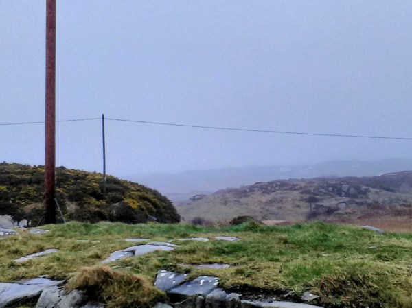
My bedroom at my daughter’s home has sliding doors out onto the garden, with views into the trees beyond. And a view out of the side windows to a stand of Scotch Pines. From my bed I can see both dawn and dusk through these trees.
The paintings are not at all a representation of these photos of views. In fact they have more of an essence of a walk in the woods. I even embedded a fern leaf in the paint, removed it the next day to leave its impression, then rolled over it again with more layers.
However, some of the colours are there. A friend of mine said of these two latest pieces that they were a return for me of a ‘confident enigma’. I like that
Dawn:

Dusk:

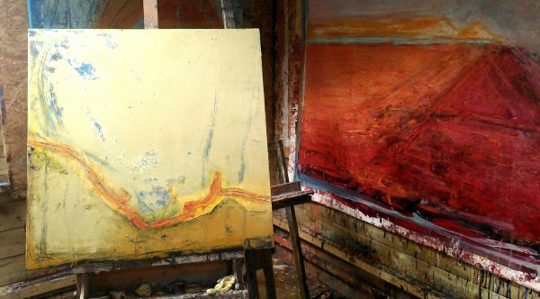
Here are 2 of my recent large works
The top one is ‘Evening walk, Cruit’
110 x 160cm
The bottom one is ‘Ruined gables, facing West’ , 120 x 160cm


They were both painted during the same short period of a few weeks, about 4 or 5 months ago, in Winter.
They were both inspired by, and had their starting point in an evening walk at sunset, with the Western light, on the tracks around our home on Cruit
They are both unusual for me as they were mostly painted using brushes. And also the paint mixture was more liquid and had a higher proportion of oil, so the surface us more glossy than usual
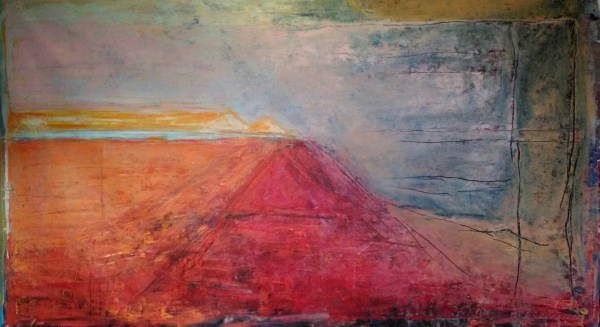
Both have some strong diagonal marks as central structures to the composition.
The top piece is more balanced, with a fairly traditional compositional structure, with the mountain and horizon quite central.
The lower piece has a distorted, unbalanced structure, with a weird sloping section to the horizon on the left, and strong diagonal marks ambiguously reaching down from the pyramidal forms into the foreground
The brush marks were applied very quickly in both works. And there are dribbles and splashes
The colours in the top piece are warm and strong, but mostly complimentary and /or harmonious. Whereas the colour in the lower piece are strong and sometimes clashing, even bilious.
For me the results are very different. The top painting is comfortable, even comforting. The lower piece is unsettling, maybe anxious making.
I have never analyzed my work like this before. I almost never write any sort of artist statement. I would be very interested to hear what other people might think. About these paintings. Or about me writing about my own work. No holds barred! Please be honest. A diogue would be great. Thanks
Some paintings from June


On a wet, closed in StPatrick’s Day, nothing for it but to get on with the mundane jobs in the studio

Painting the edges is a rather precarious job, with paintings balanced at odd angles in strange combinations, often upside down

I usually mix a colour in harmony with the painting, but not an exact match to any of the colours I used in the work itself

This blue and yellow pair of square canvases is an exception, as I used the same blue as in the paintings to try and emphasise the feeling of spaciousness I was trying to capture in relatively small works

I had already painted the edges of these, but have reworked them, so the bright turquoise edge seems too strong now, so I’ve mixed a pale olive green. However, it might be a bit dark, so I’ll probably try yet again!

I’m using a lot of light mixes for layering over some older works. Favouring ochres, yellows, pale blues laid over the deeper and bolder tones underneath. This is creating some depth and I’m adding further texture with light lines and scrapes using solvent followed by a palette knife


This enormous painting continues to challenge me
It is 150cm x 240cm on primed canvas currently stapled to the wooden wall of my studio
The main debate with myself is about the horizon line. I am gradually settling to a decision to keep the horizon visible only on the left. On the right the orientation of the landscape becomes ambiguous.
Today I added a pink layer over the darker tones on the top right section and also some ochre areas. And then applied solvent and made some deep marks with a palette knife to reveal the dark blue underneath


It started like this, a huge piece of primed canvas (160 x 258cm, the end of the roll), stapled to the floor.
It took up so much of the floor that I had to stand on it to get round it


After a while working on it on the floor, I got Malachy to help me hang it sideways on the wall

And then I turned it round the right way

I taped off the edges, built up more layers and thought it was done.
But something was unbalanced
So finally I took the plunge

There she blows!
Here’s a closeup

And here’s a photo montage

A good day!


Photo

Edited, a notated photo

Painting in progress, 110cm x 160cm

Detail
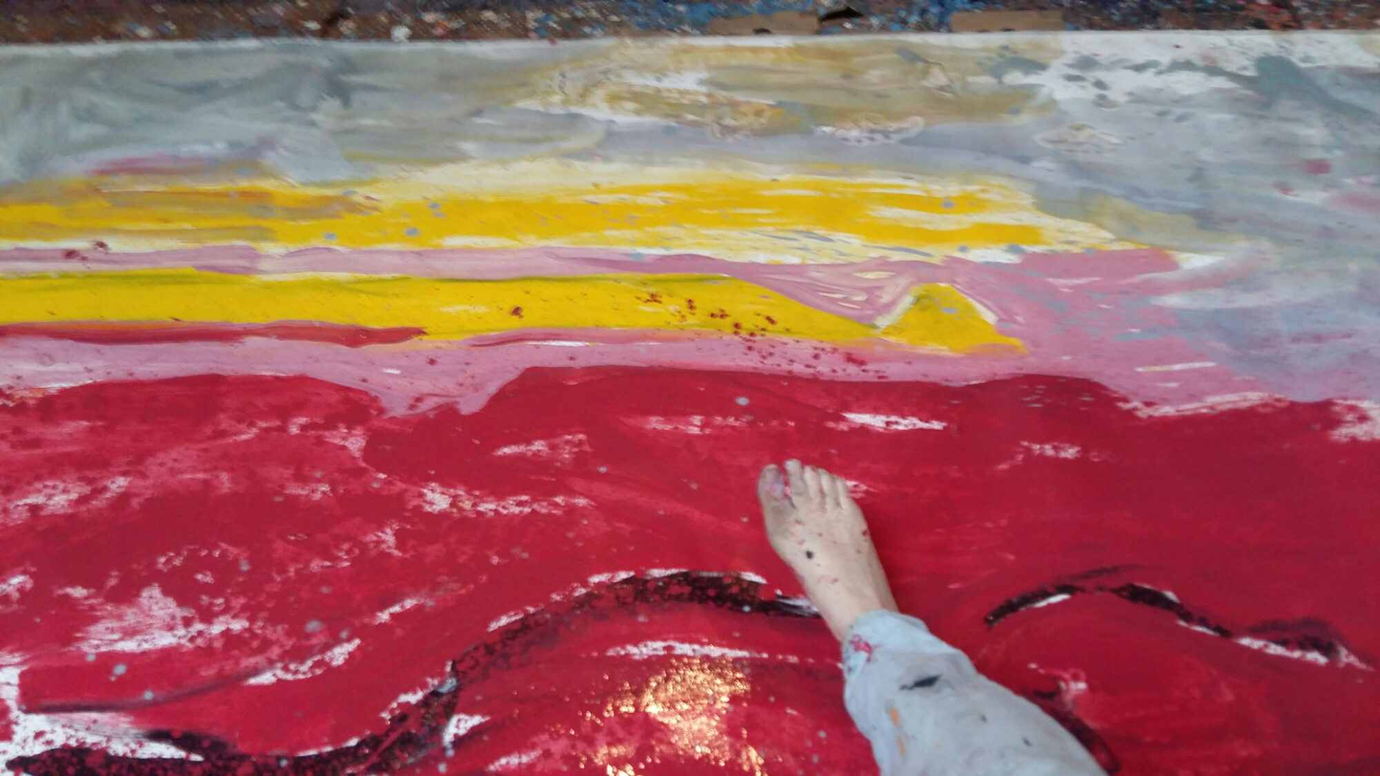
I got up quite late but I was unusually fired up once I got going. Maybe it was coffee, or perhaps a sugar hit from all the Christmas chocolate
Things started off fairly sedately with lots of greys and blues and muted tones on the huge new canvas

After working for about 2 hours I went inside for a break. The range had got lovely and hot and the spud I’d put in was crispy and delicious. Got cleaned up and thought that was it for the day. Then had more coffee and chocolate and decided to go back out for a bit
Worked on the big piece some more. Then all of a sudden decided to go all out in red and pink on the 2 canvases that had been on the wall earlier, AND the little muted ones on the opposite wall AND several others


A stonechat is a small bird with a black head that makes the sound of 2 stones knocked together. They flit about madly from the top of furze (gorse) bushes, which are yellow and spike. My surge of energy felt a bit like a transmutation (?) – like in the old tales when a person is magically changed from person to hare to bird
The header image is the railing in the bedroom – perhaps the initial spark for all the stripes – who knows where it all comes from!
