pale yellow with blues

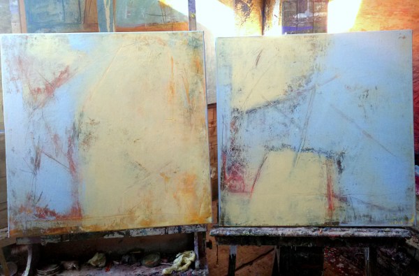
These 2 are each 60cm square and have undergone a change of heart, or a facelift or a renaissance! Formerly they were darker and mostly orange and quite ‘loud’ with a title to reflect that mood : ‘Tolerate chaos’- the title taken from the 10 well known painting rules of the Bay artist, Richard Diebenkorn.

Now they are calmer and paler, with a new title, ‘Formerly chaos’, perhaps with a nod to us being in control of our moods along with our palette if we so choose!


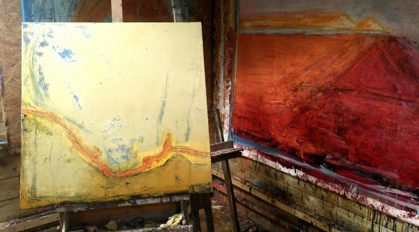
These 2 are a bit bigger, at 80cm square. They have had a similar transformation using a pale palette of pale ochres, yellows and some very pale blue. Their former title was ‘Oceans, a tipping point’ – part of a series of 5 canvases. They haven’t got new individual names yet 


Thus one is ‘Musing’, also 80cm square plus frame, painted 2 years ago on my furst residency at Stiwdio Maelor in Corris in Wales and then exhibited at a group show at Terre Verte Gallery in Cornwall. Home now from her adventures


These 2, ‘Sunshine 1&2’ have also just returned from Cornwall and are also each 80cm square plus frame

a light touch

I’m using a lot of light mixes for layering over some older works. Favouring ochres, yellows, pale blues laid over the deeper and bolder tones underneath. This is creating some depth and I’m adding further texture with light lines and scrapes using solvent followed by a palette knife


Island Life

This enormous painting continues to challenge me

It is 150cm x 240cm on primed canvas currently stapled to the wooden wall of my studio

The main debate with myself is about the horizon line. I am gradually settling to a decision to keep the horizon visible only on the left. On the right the orientation of the landscape becomes ambiguous.

Today I added a pink layer over the darker tones on the top right section and also some ochre areas. And then applied solvent and made some deep marks with a palette knife to reveal the dark blue underneath

the doorway gallery, dublin

A small work on paper, glazed and framed


A warm, large, (80cm sq)autumn inspired piece on cradled birch panel


An even larger, (100 cm sq), framed piece on canvas, ‘Rock in the Sea’


Wintery, but warm, framed 80cm sq piece on canvas


A bold, framed, pink, red and blue abstract on board, ‘ Deeper yet and darker still’60cm sq


‘Skylight’, 90cm sq, framed oil on board

http://www.thedoorwaygallery.com/

2016 retrospective

Painted end of 2015

Sold early 2016 and paid for my trip to San Francisco and New York! 


Working on my ‘Rock in the sea’ paintings in February


Some huge pieces on unstretched jute in March


‘Tis calm indeed’ and ‘Moon rising’ from my Spring residency at Stiwdio Maelor in Corris, Wales 


The huge, rather surreal piece on unstretched jute ‘Clouds’ from May


The 5 piece orange and blue and black canvases – can’t remember their titles! June


The two big (120cm sq) pieces, ‘Stateside’ made in anticipation of my  big US trip in June


Small works on paper (these 2 are ‘Berkeley’ & ‘5th Avenue’) made on the go during my fantastic, life changing USA adventure in June and July


Some of the big bold pieces I made in July as soon as I got back from New York 


‘The path’ & ‘Convergence’

August works in the back kitchen in Wales


‘The dance’ & ‘Columba’ also from August in Wales


Works from my second residency in Stiwdio Maelor in Corris, Wales in September 


November


December!

Looking forward to 2017

shibui

​I have been playing with these ideas and tones, this extract is from Wikipedia:

Shibui (渋い) (adjective), shibumi (渋み) (noun), or shibusa (渋さ) (noun) are Japanese words which refer to a particular aesthetic of simple, subtle, and unobtrusive beauty.

The colors of shibusa are “muddy” colors. For example, in interior decorating and painting, gray is added to primary colors to create a silvery effect that ties the different colors together into a coordinated scheme. Depending upon how much gray is added, shibui colors range from pastels to dark. Occasionally, a patch of brighter color is added as a highlight.

The seven elements of shibusa are simplicity, implicity, modesty, silence, naturalness, everydayness, and imperfection. 

https://en.m.wikipedia.org/wiki/Shibui

without you can’t get in

It started with a search for something to paint over because I’ve run out of canvas.

I chose these 2 as they are rather boring and not too textured or lumpy

They are each 70 x 50cm on board

I laid down some first layers and decided to turn them sideways

I was thinking about people out on the street during these cold winter nights and started to make some loose marks with solvent and a palette knife. I have some new gold Winsor and Newton oil. Added some of that, mixed with wax, with a roller. The shapes are clumsy and awkward

The song from Paul Simon’s new album, called wristband, the third verse running through my head. The bit about riots and how not having a wristband to get you in the door becomes a metaphor for the excluded and disenfranchised. Thinking about the election of Trump. And Brexit.

http://www.songfacts.com/detail.php?id=40220

Add more colour. Roll over and obliterate most of the scraped marks. Make some new marks with a graphite stick

Thinking too about the desperate situation in Aleppo. And David Wolfe’s moving and horifying before and after photos on Facebook 

https://m.facebook.com/story.php?story_fbid=1290315790990889&id=100000374406030
It’s not about pretty pictures

What is it about? Painting? What do we do it for? Why? How? Is there any point?

Darker and deeper

More confusing

I don’t know. But I keep painting

(Header image is another stage on the journey, not the finished image – I signed it then changed my mind)

Blood and concrete


2 canvases each 100 x 80cm (39 x 31.5″)

As 2016 draws to a close I’m trying, against the odds, to look ahead to 2017 with hope.

Hope that we will all be mindful of anything we can do that helps rather than hinders. In so many areas. For Peace. For People. For the Planet 

The paintings above are called ‘blood and concrete’.