edges

On a wet, closed in StPatrick’s Day, nothing for it but to get on with the mundane jobs in the studio

Painting the edges is a rather precarious job, with paintings balanced at odd angles in strange combinations, often upside down

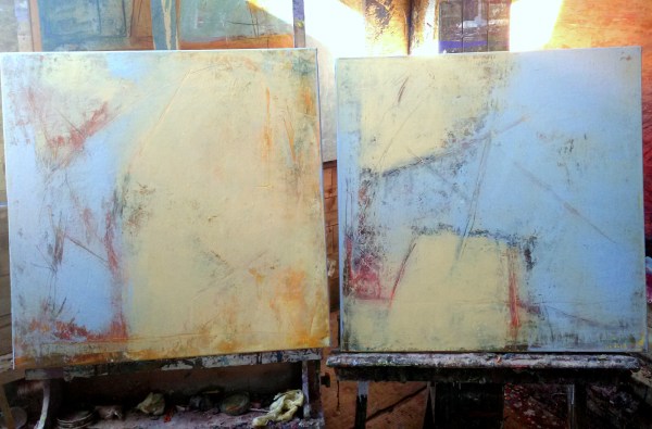
I usually mix a colour in harmony with the painting, but not an exact match to any of the colours I used in the work itself

This blue and yellow pair of square canvases is an exception, as I used the same blue as in the paintings to try and emphasise the feeling of spaciousness I was trying to capture in relatively small works

I had already painted the edges of these, but have reworked them, so the bright turquoise edge seems too strong now, so I’ve mixed a pale olive green. However, it might be a bit dark, so I’ll probably try yet again!

pale yellow with blues

These 2 are each 60cm square and have undergone a change of heart, or a facelift or a renaissance! Formerly they were darker and mostly orange and quite ‘loud’ with a title to reflect that mood : ‘Tolerate chaos’- the title taken from the 10 well known painting rules of the Bay artist, Richard Diebenkorn.

Now they are calmer and paler, with a new title, ‘Formerly chaos’, perhaps with a nod to us being in control of our moods along with our palette if we so choose!


These 2 are a bit bigger, at 80cm square. They have had a similar transformation using a pale palette of pale ochres, yellows and some very pale blue. Their former title was ‘Oceans, a tipping point’ – part of a series of 5 canvases. They haven’t got new individual names yet 


Thus one is ‘Musing’, also 80cm square plus frame, painted 2 years ago on my furst residency at Stiwdio Maelor in Corris in Wales and then exhibited at a group show at Terre Verte Gallery in Cornwall. Home now from her adventures


These 2, ‘Sunshine 1&2’ have also just returned from Cornwall and are also each 80cm square plus frame

a light touch

I’m using a lot of light mixes for layering over some older works. Favouring ochres, yellows, pale blues laid over the deeper and bolder tones underneath. This is creating some depth and I’m adding further texture with light lines and scrapes using solvent followed by a palette knife


island life

It started like this, a huge piece of primed canvas (160 x 258cm, the end of the roll), stapled to the floor.

It took up so much of the floor that I had to stand on it to get round it


After a while working on it on the floor, I got Malachy to help me hang it sideways on the wall

And then I turned it round the right way

I taped off the edges, built up more layers and thought it was done.

But something was unbalanced

So finally I took the plunge


There she blows!

Here’s a closeup 


And here’s a photo montage


A good day!

like a stonechat on a furze bush

I got up quite late but I was unusually fired up once I got going. Maybe it was coffee, or perhaps a sugar hit from all the Christmas chocolate

Things started off fairly sedately with lots of greys and blues and muted tones on the huge new canvas


After working for about 2 hours I went inside for a break. The range had got lovely and hot and the spud I’d put in was crispy and delicious. Got cleaned up and thought that was it for the day. Then had more coffee and chocolate and decided to go back out for a bit

Worked on the big piece some more. Then all of a sudden decided to go all out in red and pink on the 2 canvases that had been on the wall earlier, AND the little muted ones on the opposite wall AND several others


A stonechat is a small bird with a black head that makes the sound of 2 stones knocked together. They flit about madly from the top of furze (gorse) bushes, which are yellow and spike.  My surge of energy felt a bit like a transmutation (?) – like in the old tales when a person is magically changed from person to hare to bird

The header image is the railing in the bedroom – perhaps the initial spark for all the stripes – who knows where it all comes from!

laying the groundwork


I was priming a large piece of coarse jute canvas today with gesso. A long piece 3m x 120cm, rolled out on the mucky floor of the studio.

I took photos as I worked as usual. Of the process and the light and shadows. Of me working. Of the canvas up on the wall. Of the fire.Pondering all the while on what I’ll actually paint once it’s ready


Messed with the photos on Instagram later. Cropped. Negative. Brighten. Contrast. The wee pebble embedded in the rough cement render. In blue. In yellow. The fire. The different rectangles. In triplicate.


The studio is always a painting. In a painting. Of a painting. During a painting.

2016 retrospective

Painted end of 2015

Sold early 2016 and paid for my trip to San Francisco and New York! 


Working on my ‘Rock in the sea’ paintings in February


Some huge pieces on unstretched jute in March


‘Tis calm indeed’ and ‘Moon rising’ from my Spring residency at Stiwdio Maelor in Corris, Wales 


The huge, rather surreal piece on unstretched jute ‘Clouds’ from May


The 5 piece orange and blue and black canvases – can’t remember their titles! June


The two big (120cm sq) pieces, ‘Stateside’ made in anticipation of my  big US trip in June


Small works on paper (these 2 are ‘Berkeley’ & ‘5th Avenue’) made on the go during my fantastic, life changing USA adventure in June and July


Some of the big bold pieces I made in July as soon as I got back from New York 


‘The path’ & ‘Convergence’

August works in the back kitchen in Wales


‘The dance’ & ‘Columba’ also from August in Wales


Works from my second residency in Stiwdio Maelor in Corris, Wales in September 


November


December!

Looking forward to 2017

shibui

​I have been playing with these ideas and tones, this extract is from Wikipedia:

Shibui (渋い) (adjective), shibumi (渋み) (noun), or shibusa (渋さ) (noun) are Japanese words which refer to a particular aesthetic of simple, subtle, and unobtrusive beauty.

The colors of shibusa are “muddy” colors. For example, in interior decorating and painting, gray is added to primary colors to create a silvery effect that ties the different colors together into a coordinated scheme. Depending upon how much gray is added, shibui colors range from pastels to dark. Occasionally, a patch of brighter color is added as a highlight.

The seven elements of shibusa are simplicity, implicity, modesty, silence, naturalness, everydayness, and imperfection. 

https://en.m.wikipedia.org/wiki/Shibui